Overview
The TuGo kiosk is a concept that allows travellers to purchase travel insurance on-site at various locations including the airport and insurance providers partnered with TuGo. It was designed as part of a tech demo to showcase possible concepts to be implemented by the company at a later phase.
As the lead designer on the project, I worked closely with the development team and platforms manager on the design and execution of the project.
The Challenge
The challenge was to design an experience that would be intuitive yet engaging for the traveller so they would consider using a kiosk to purchase travel insurance. Travellers that would be more likely to use a kiosk include last-minute buyers that happen to see a kiosk at the airport. The younger demographic would also be more inclined to use a kiosk given their frequent use of technology. The experience would need to cater to all these needs.
Details
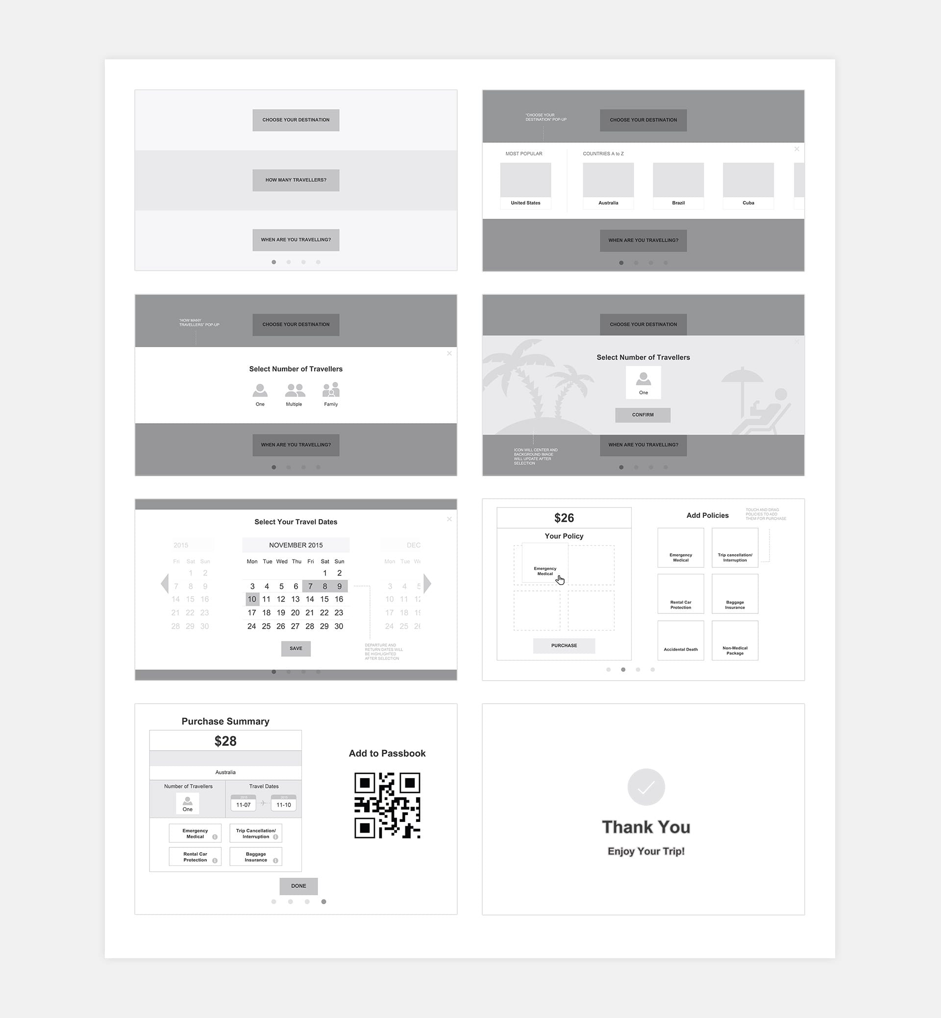
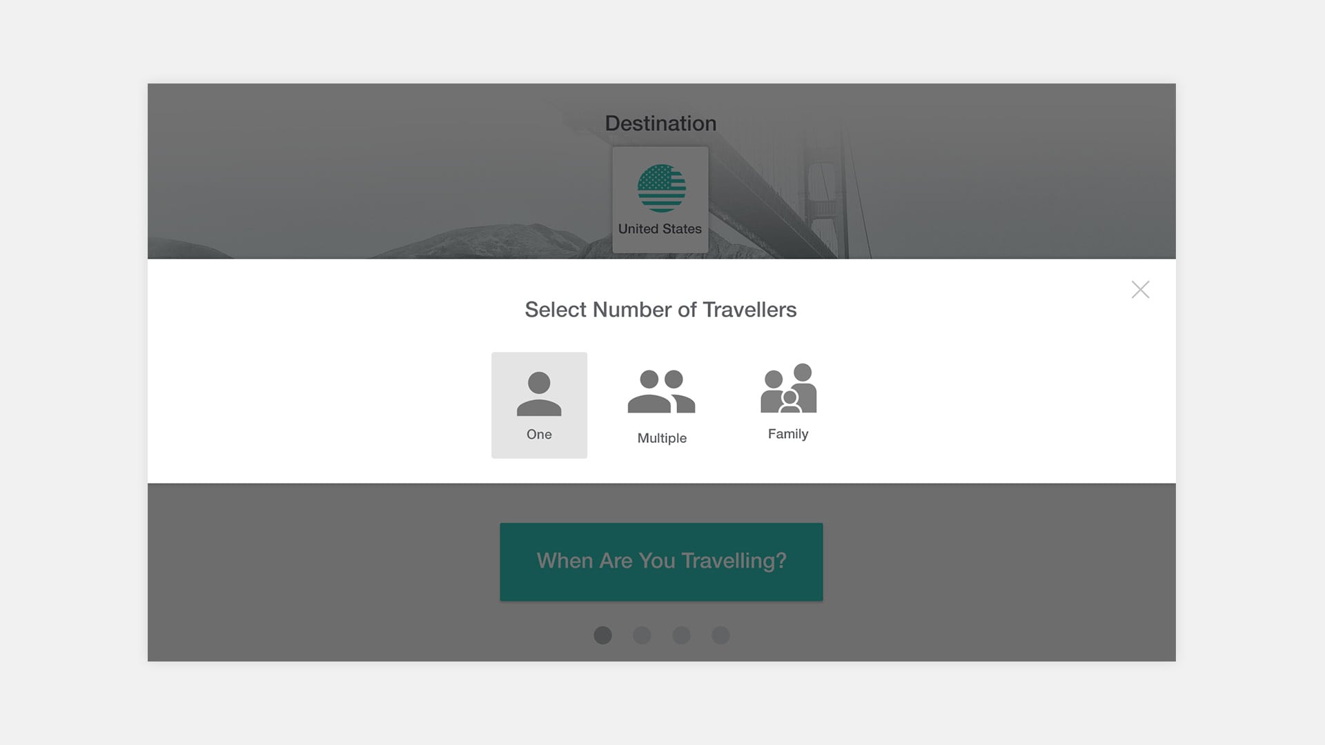
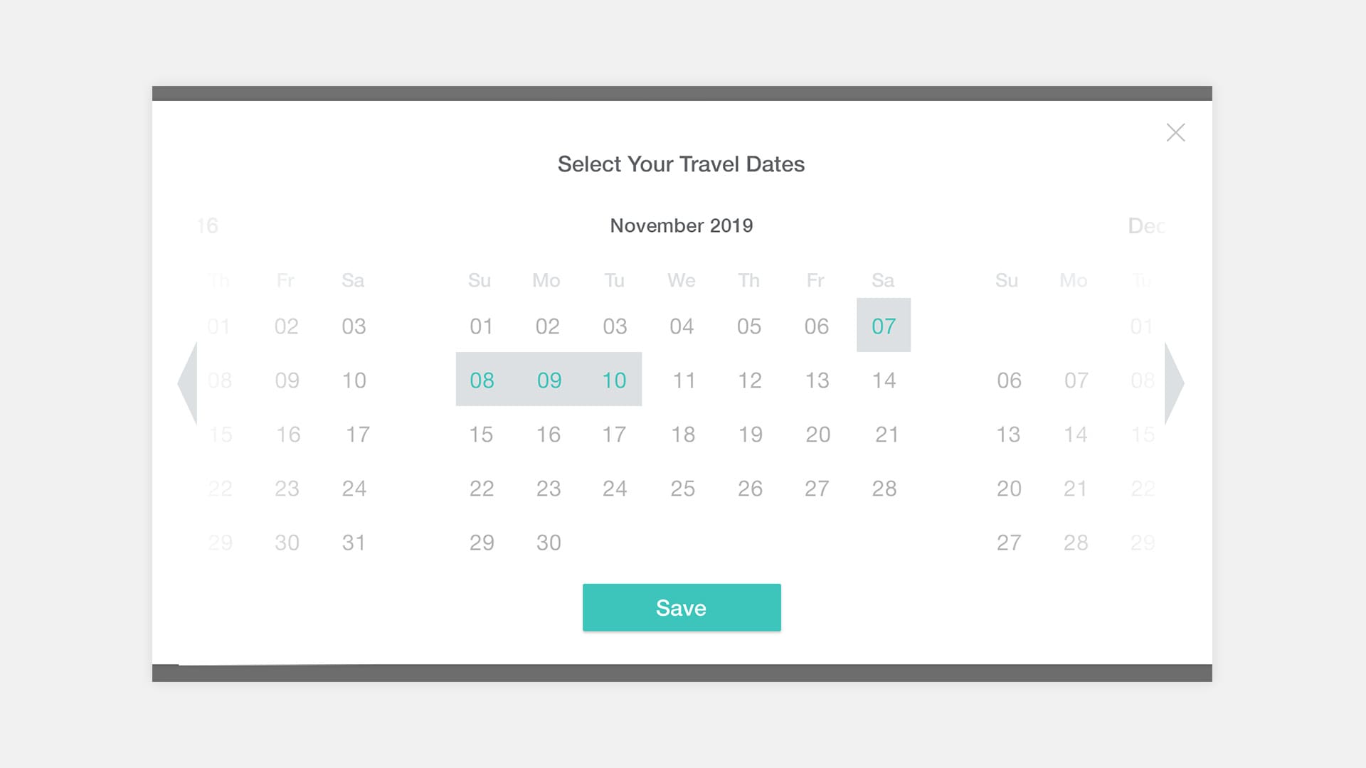
Wireframing
Creating wireframes helped to define the visual structure of the kiosk experience. Designing for a touch screen interface meant that visual elements including buttons and callouts are essential to guide the traveller through the experience. Fine-tuning those details at this stage was helpful before creating high fidelity mockups.
The Solution
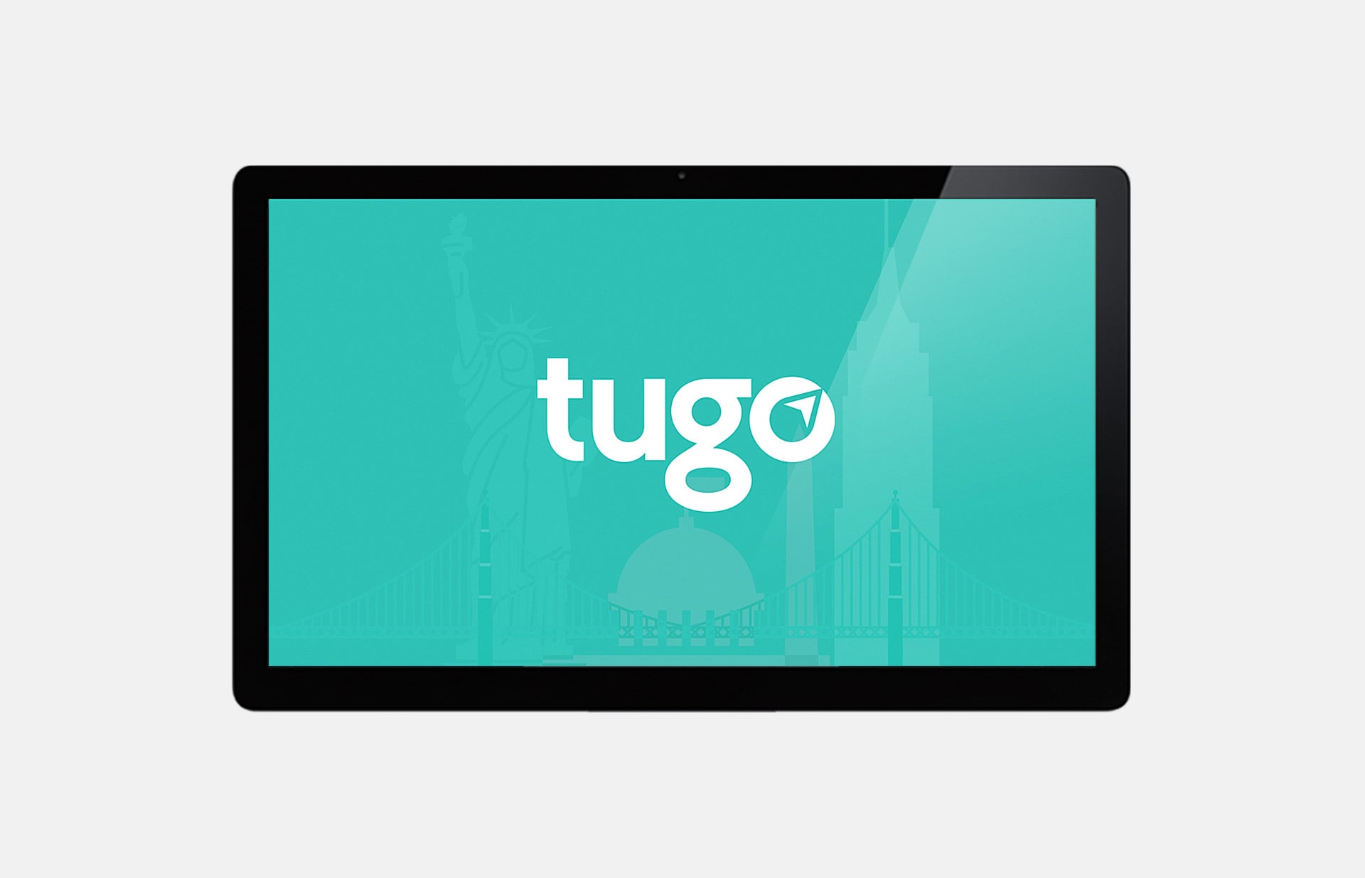
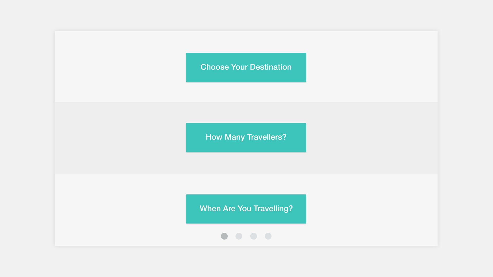
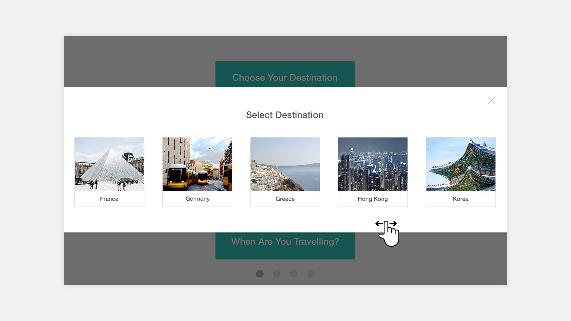
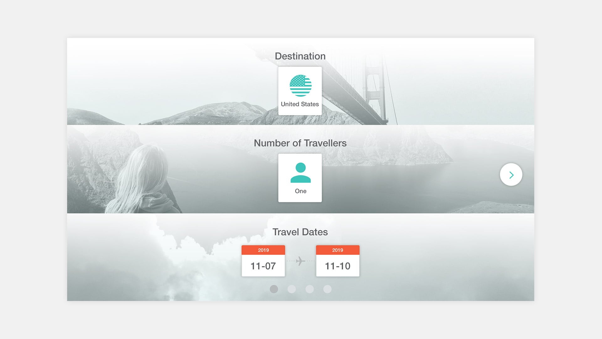
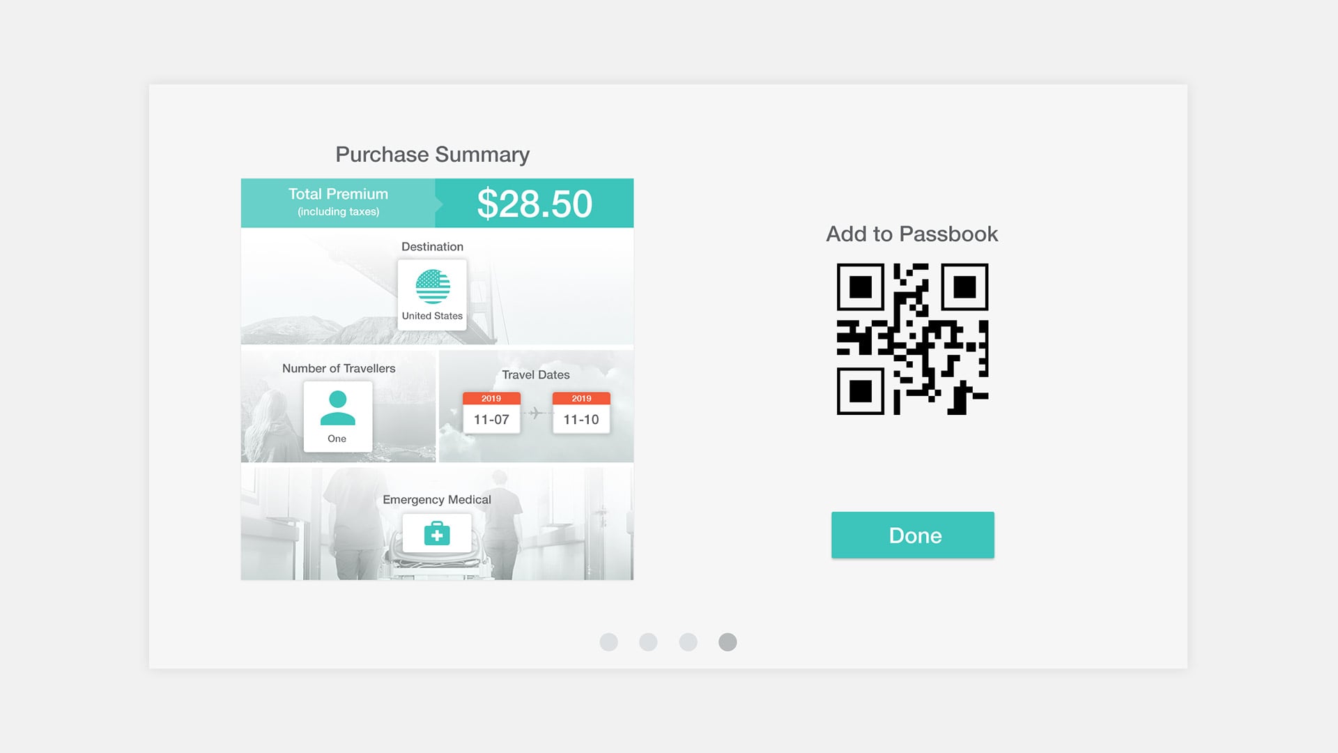
The end result was an experience that allows travellers to add their travel details and see their selections on screen visually. It starts with the welcome screen which features the TuGo logo and colours as well as travel themed illustrations to encourage travellers to try the kiosk.
Mockups
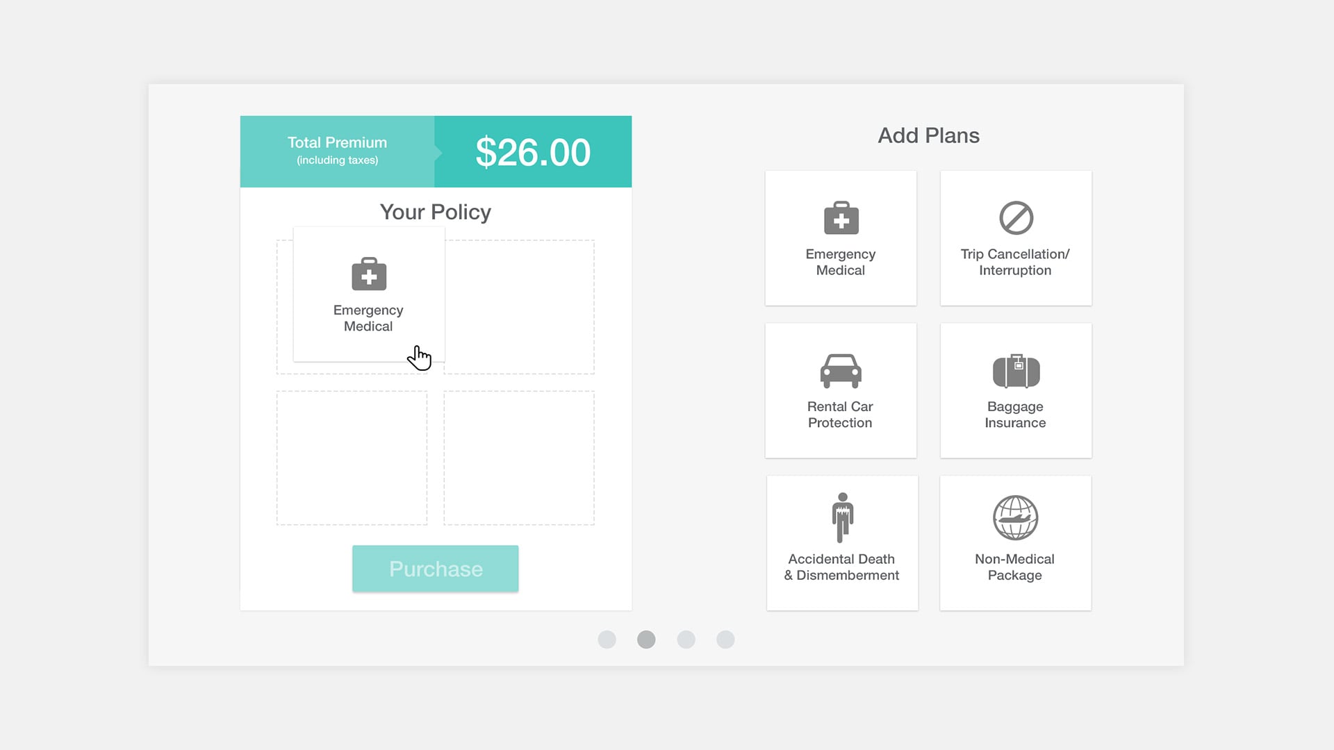
Policy Customization
Key features include a drag and drop function where travellers can customize their policy and view a visual summary of their purchase.
Learnings and takeaways
Purchasing online is by far the more common way that travellers would purchase insurance. Designing for a kiosk comes with its unique challenges so this project allowed me to think critically about the various use cases and traveller needs. Specific considerations included attention to visual cues to guide the traveller, and making sure imagery and fonts were legible from a distance to encourage travellers to use the kiosk.
Most of my digital work is comprised of web and mobile projects so it was a great experience to design for a kiosk interface. The world of digital is expanding, and for designers, that will lead to new problems to solve.