Overview
Compass is a web application used by Customer Service Reps to sell travel insurance products to customers. The project involved a redesign of the current interface with some added features including a dashboard showing recent calls and alerts.
I worked primarily on the UI and visual design of the application and worked closely with the development team, UX designer and platforms manager over the course of the project.
The Challenge
The previous web application used by Customer Service Reps lacked visual appeal and the user experience was not very intuitive. It also lacked visual cues that would greatly assist new staff in learning how to use the tools. The redesign would need to address these concerns.
Details
Research and Insights
To get insight into what specific improvements should be made, I worked with the UX designer to interview Customer Service Reps. These interviews also involved paper prototyping to get direct feedback on some early-stage concepts.
Findings include:
- The current application lacks clear visual feedback. For example, error handling and loading screens could be more prominent.
- Since Customer Service Reps are servicing customers on the phone, the application should be simple to ensure a smooth purchase process
- A visual summary of the policy would be helpful
The Solution
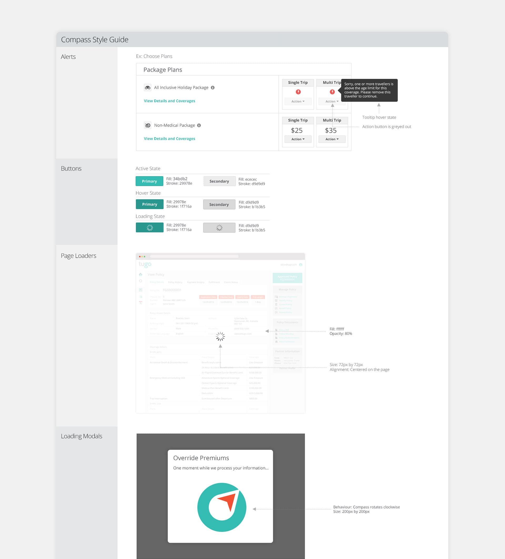
In addition to mockups, a style guide was created to capture the look and feel of common elements throughout the application including alerts, buttons and page loaders.
Style Guide
Mockups
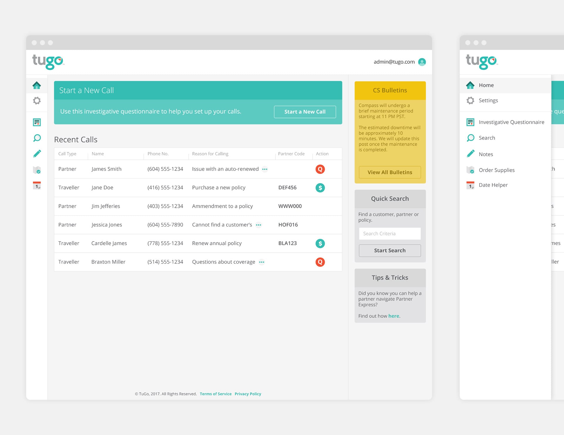
Dashboard
After login, the Customer Service Rep (CSR) would see a dashboard showing their recent calls and actions. The navigation on the left hand side is consistent throughout the application and can be expanded on hover.
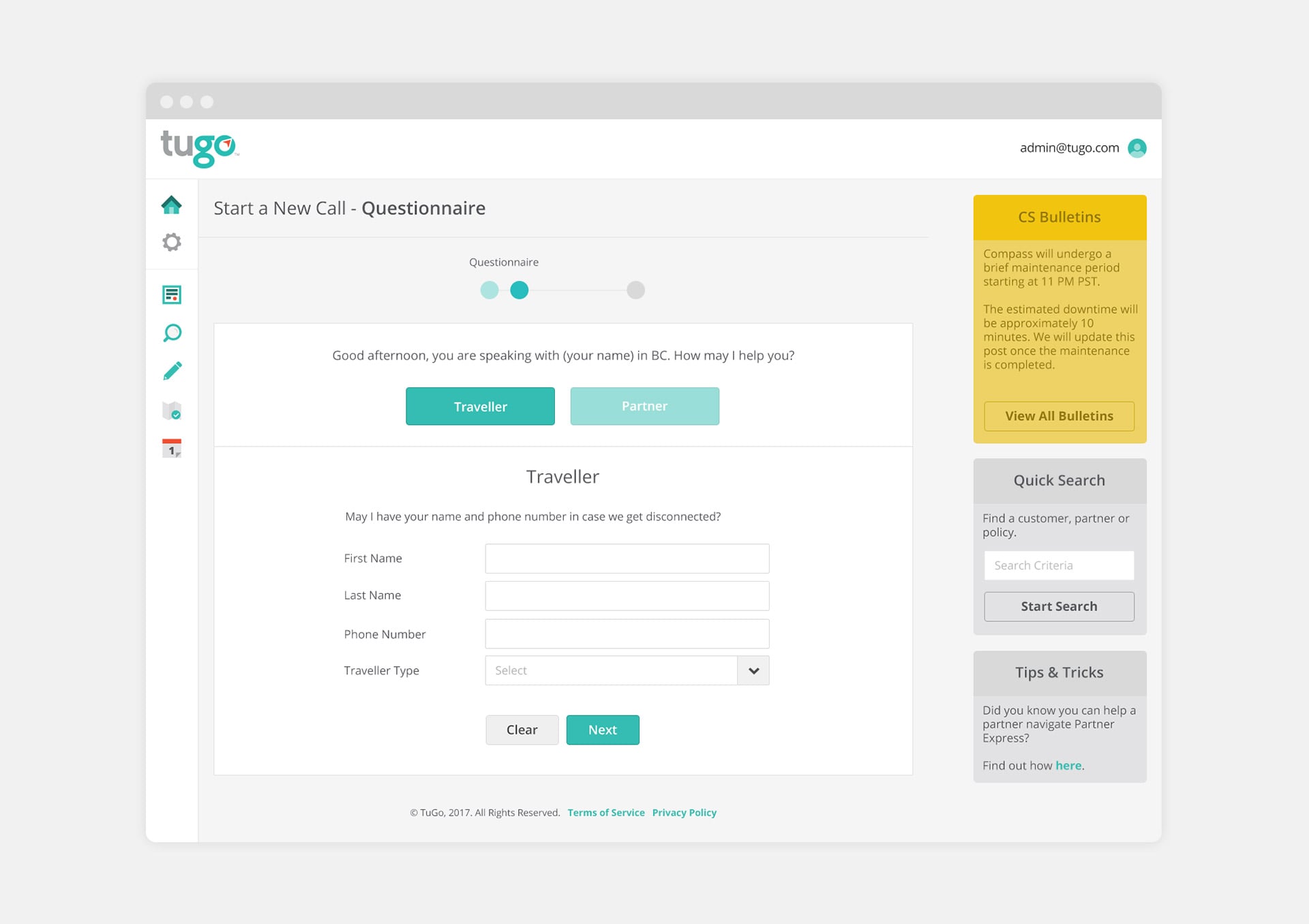
Questionnaire
At the start of each call, the CSR would often refer to a script/questionnaire to collect basic traveller information. We built this into the application so that the questionnaire would be integrated with the tool without having to refer to a separate document.
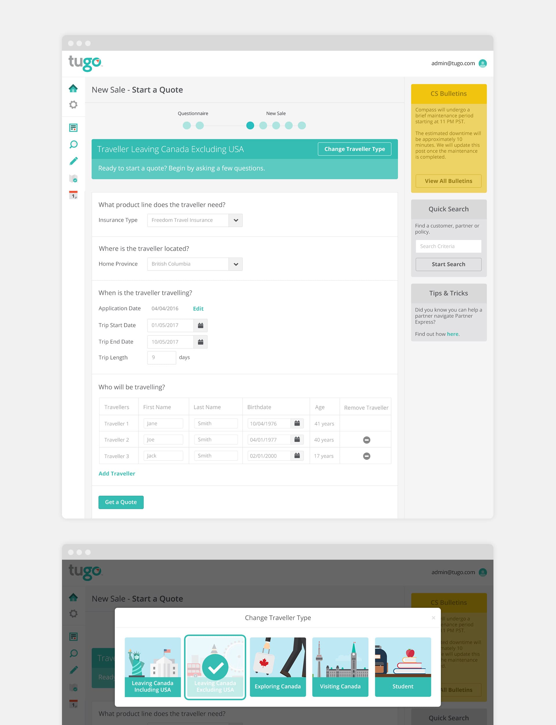
Start a Quote
After completion of the questionnaire, the CSR would then be able to start a new sale/quote. Breadcrumbs at the top show the CSR where they are in the purchase process.
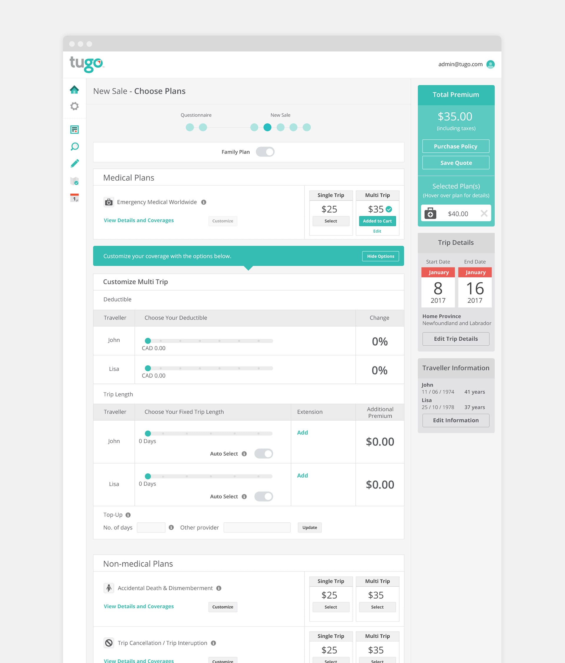
Choose Plans
As part of the purchase flow, the CSR would be able to customize plans and select between single and multi trip options. A visual summary on the right hand side reflects the latest changes including trip details and the total premium.
Learnings and takeaways
This was a challenging project in many ways. Understanding how the CSRs use the current application and their pain points were key success factors for the project. The interviews and discoveries in the early stages of the process helped steer the project in the right direction. It goes to show that an application can have high visual appeal but if it lacks in functionality, it would still fail to deliver a solid user experience. For me, this project demonstrates the importance of balancing usability and aesthetics when it comes to design.