Overview
CityGem was designed as a final project for my UX Design course at BrainStation Vancouver. All design work was completed over 5 weeks.
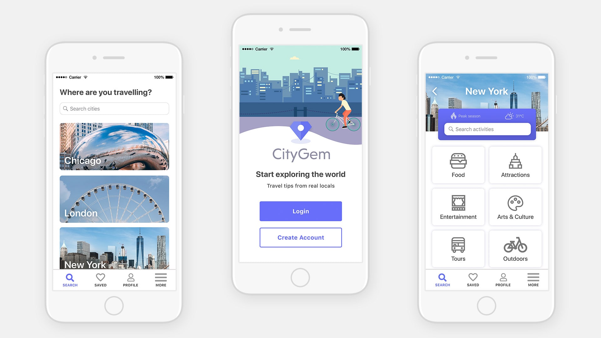
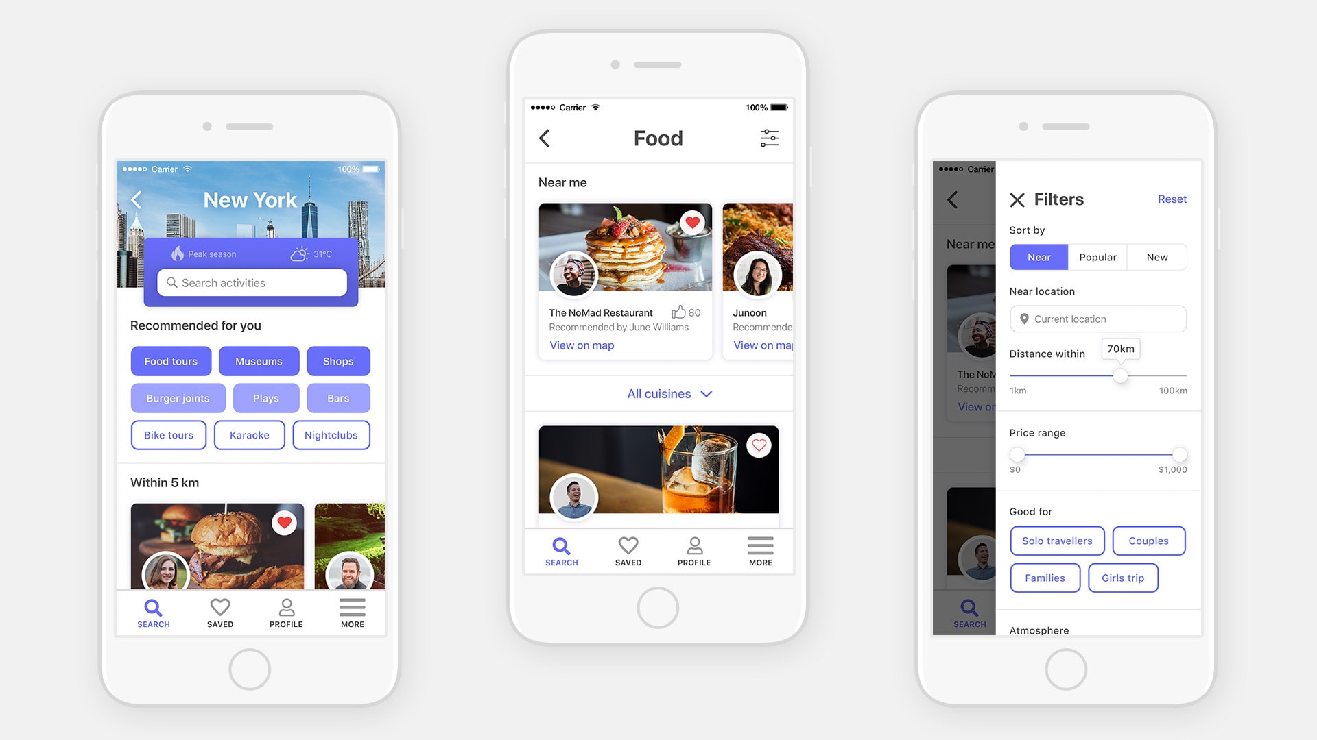
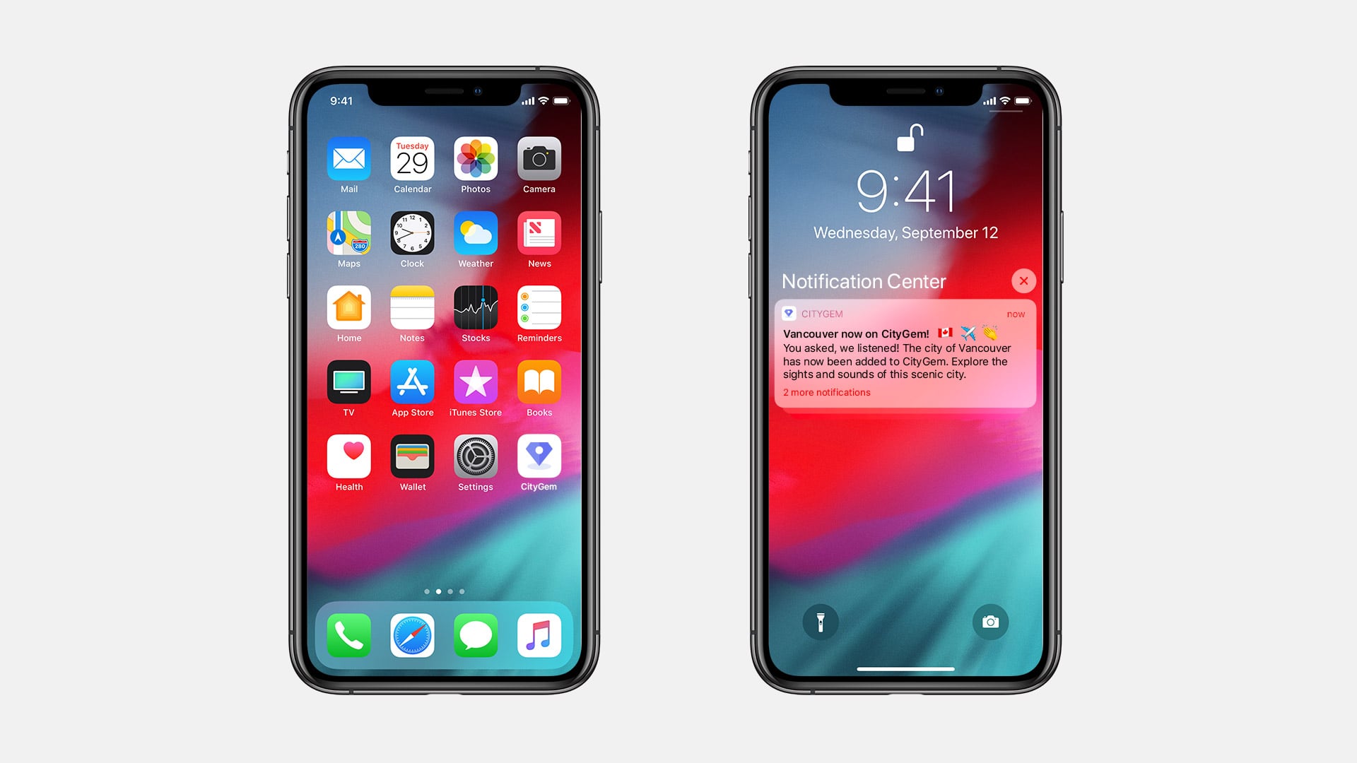
CityGem is a travel app that features curated lists of attractions, restaurants and activities selected by locals of the area to provide an authentic travel experience.
The Challenge
When travelling, it can be difficult to have knowledge of the hidden gems or recommended places to visit if you’re not a local. Travellers also have the challenge of sorting through an abundance of information and resources online when planning a trip.
The aim of this project was to make trip planning a more efficient and enjoyable experience and to provide travellers with tailored travel suggestions through an app.
Details
Research and Insights
To get an understanding of what traveller needs are and how they can be better served by an app, I conducted 5 user interviews with colleagues and friends. For each interview, I asked open-ended questions to get a sense of what their travel habits are and pain points when it comes to trip planning.
Common travel habits and goals:
- Travellers often seek suggestions from friends or locals
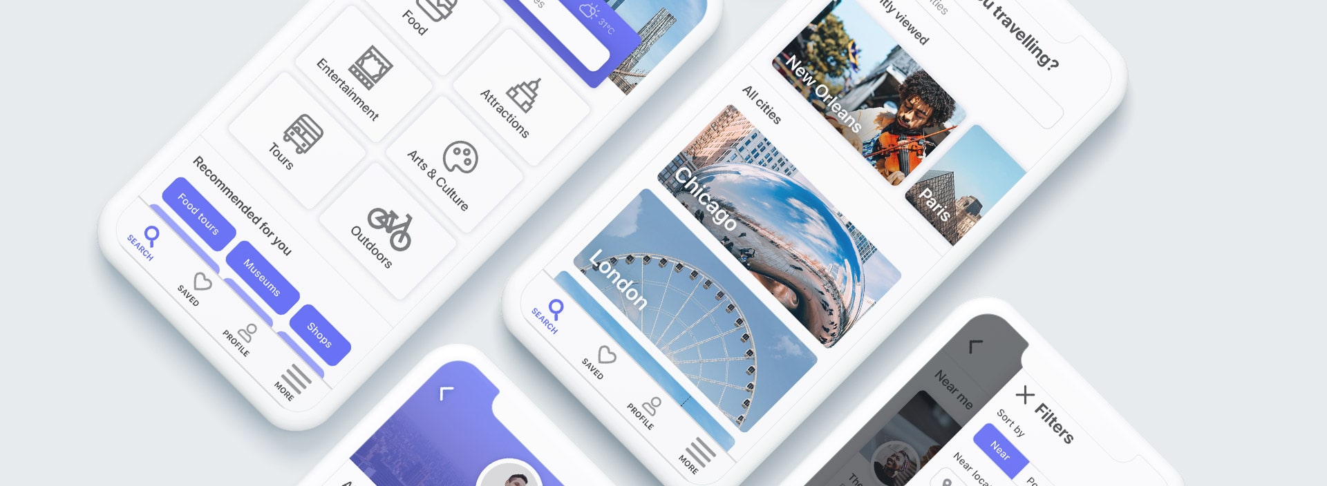
- Having filtering options would be useful to narrow down results
- A trip summary or ability to save to an itinerary would be helpful
Common pain points:
- Suggestions/reviews online can often be generic and not tailored to the individual traveller
- Overplanning can take away the mystery of a trip
- It can be challenging to find hidden gems and activities off the beaten path
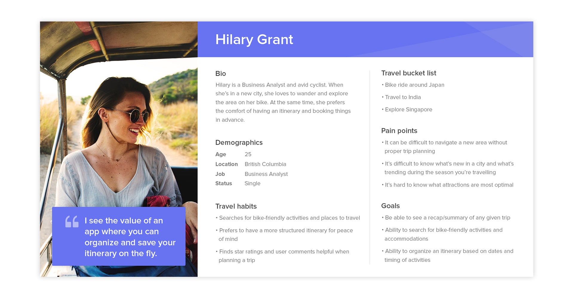
From there I gathered all the feedback on post-its which helped determine my 3 personas and the primary features they would like to see in a travel app.
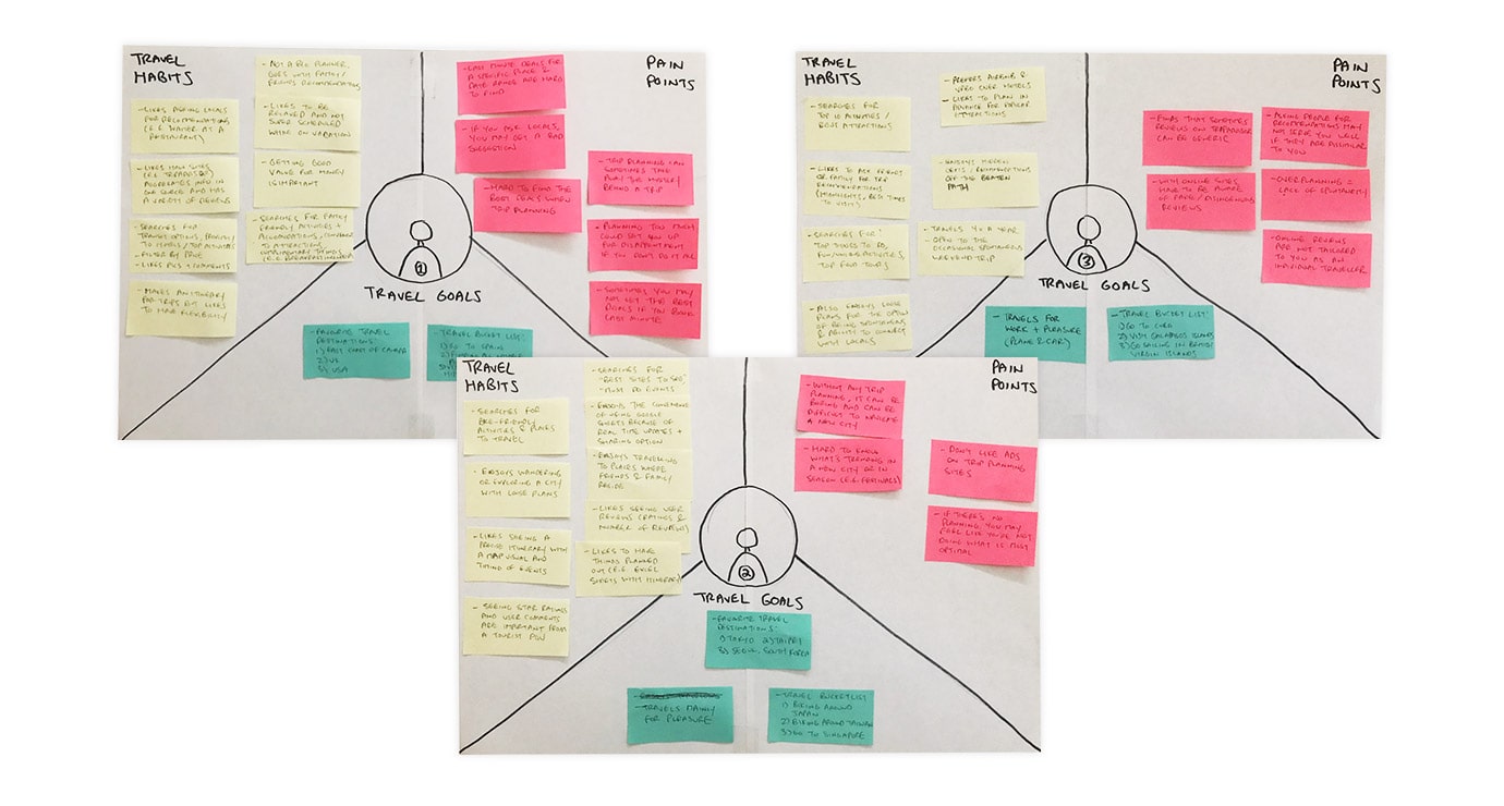
Personas:
- Hilary Grant: Likes to plan and create detailed itineraries (screenshot below)
- Ty Wallace: Prefers to keep their itinerary loose
- Claire Williams: The budget traveller who prefers minimal trip planning
