Overview
FamilyLife Equip is an online portal offering free resources to help families navigate life while fostering strong community connections. These resources include videos, blog posts, podcasts, and downloads. As the sole UI/UX designer, I worked with the digital team (including a project manager, developer, copywriter, and UX researcher) to create a portal to showcase these resources, along with a landing page to introduce the concept.
The Challenge
The online portal was a new feature that didn’t exist on the website yet, so it was designed from the ground up. This meant working through loose requirements and collaborating with the team to iterate until we landed on a solution that was both user-friendly and intuitive. Understanding the audience played a big role in the process, along with partnering with the UX research team to validate our ideas along the way. We also had to keep in mind that the portal would need to scale as more resources get added in the future, starting with just a limited set at launch.
Details
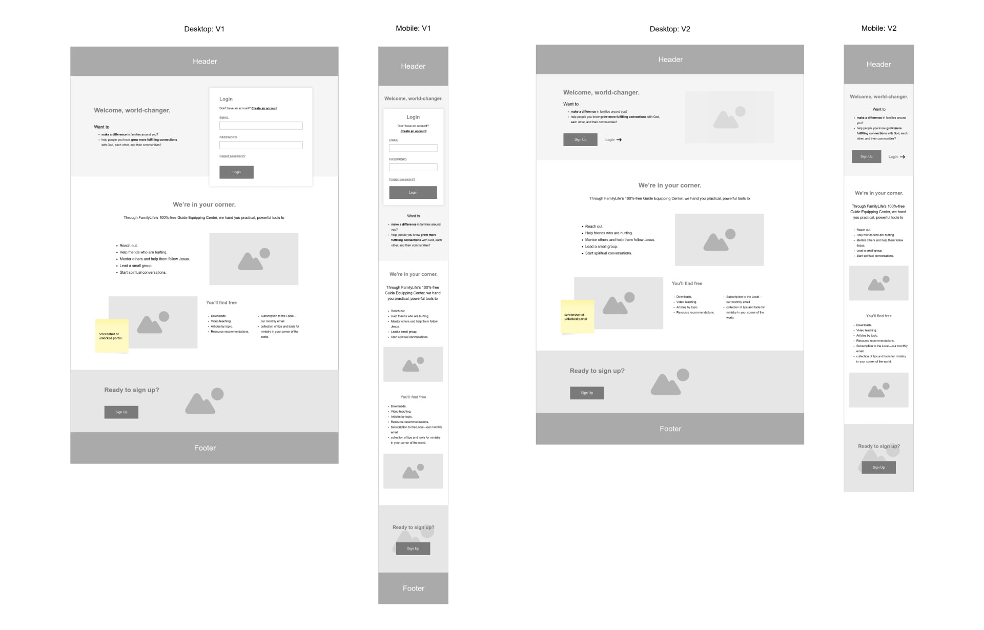
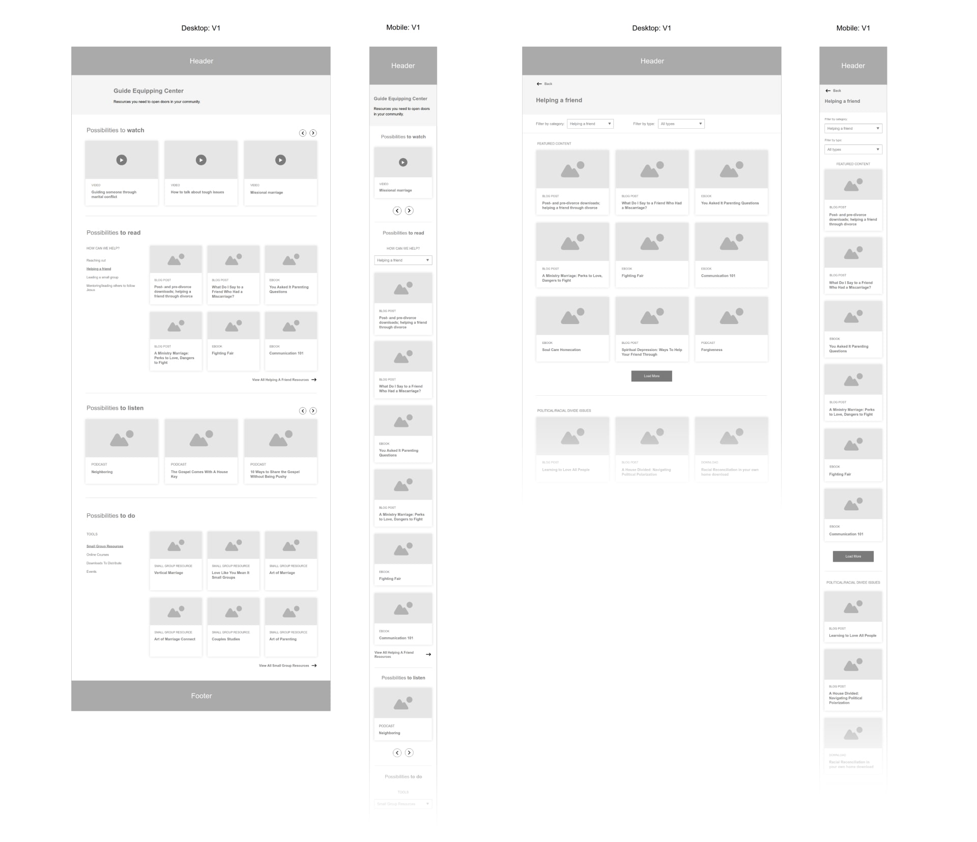
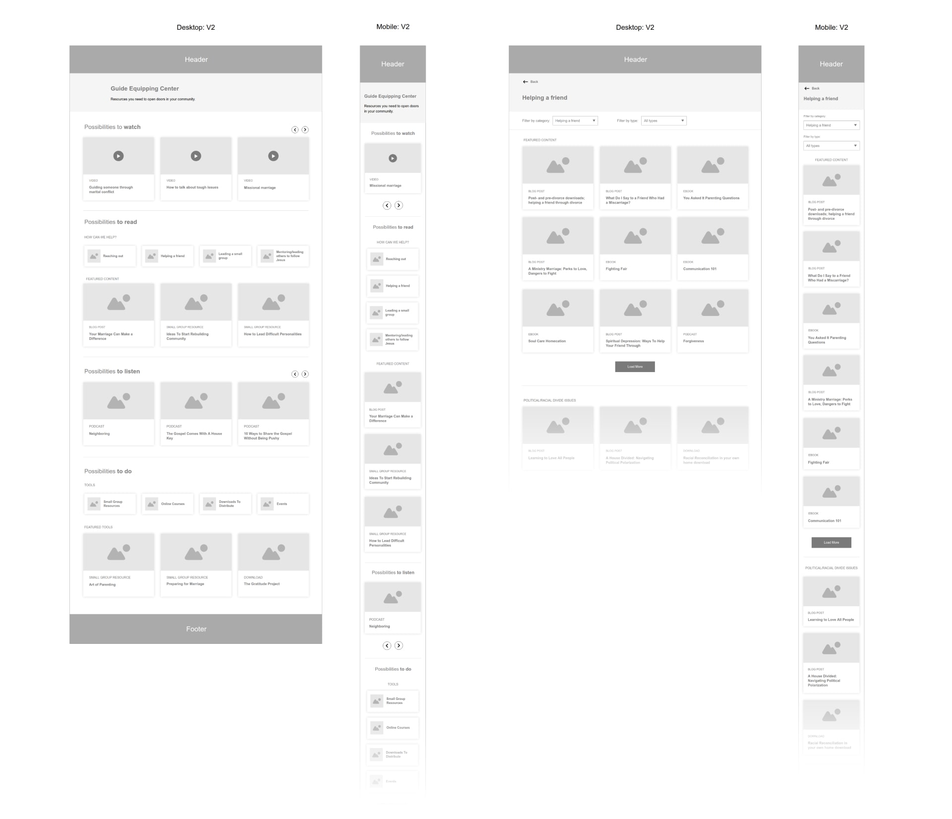
Wireframing
During the initial design phase, multiple low-fi concepts were presented to the team and stakeholders. This allowed us to have a proper understanding of the flow and have it validated before moving on to high fidelity designs.
Landing Page: V1-2
Online Portal: V1
Online Portal: V2
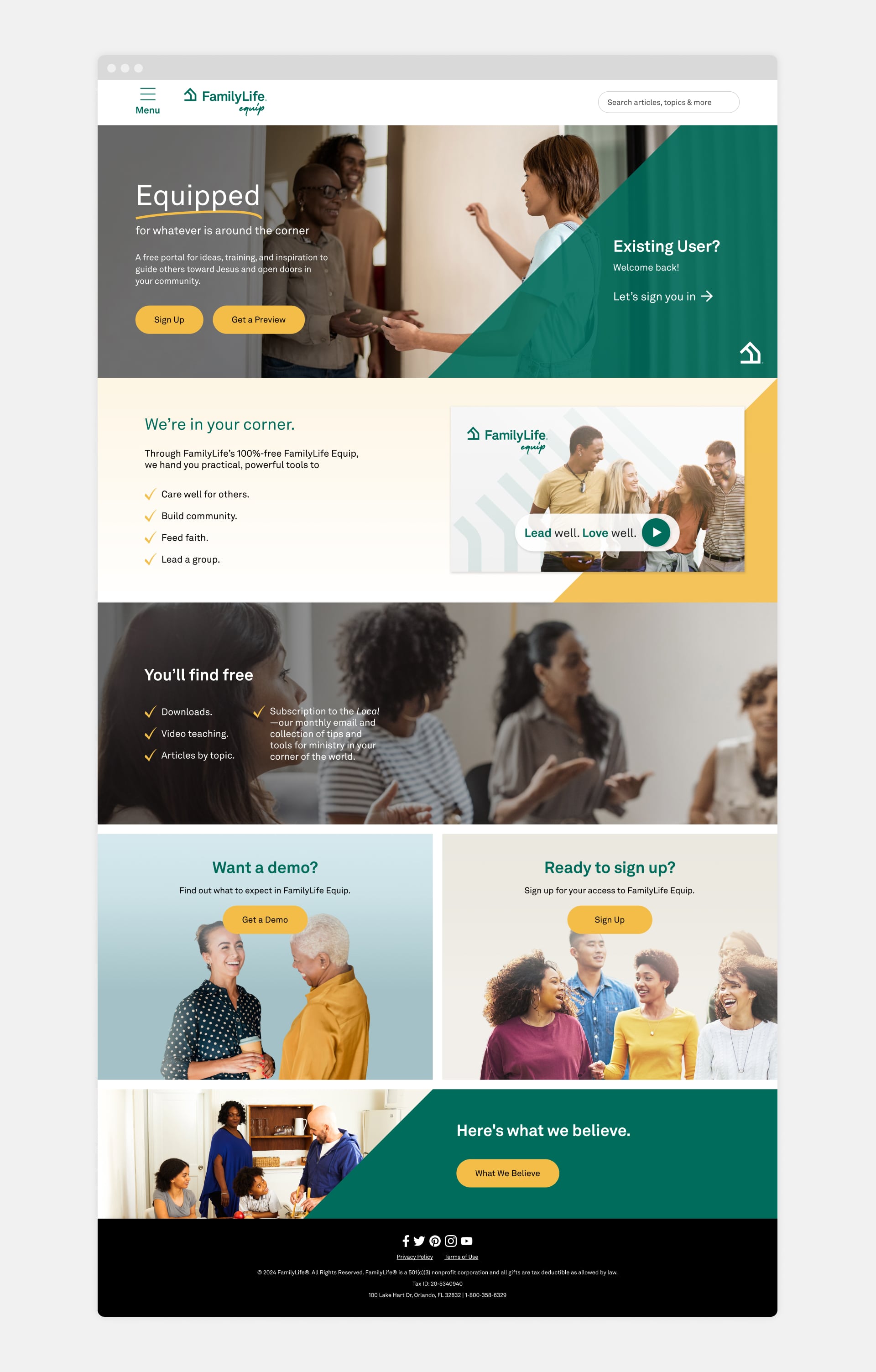
The Solution
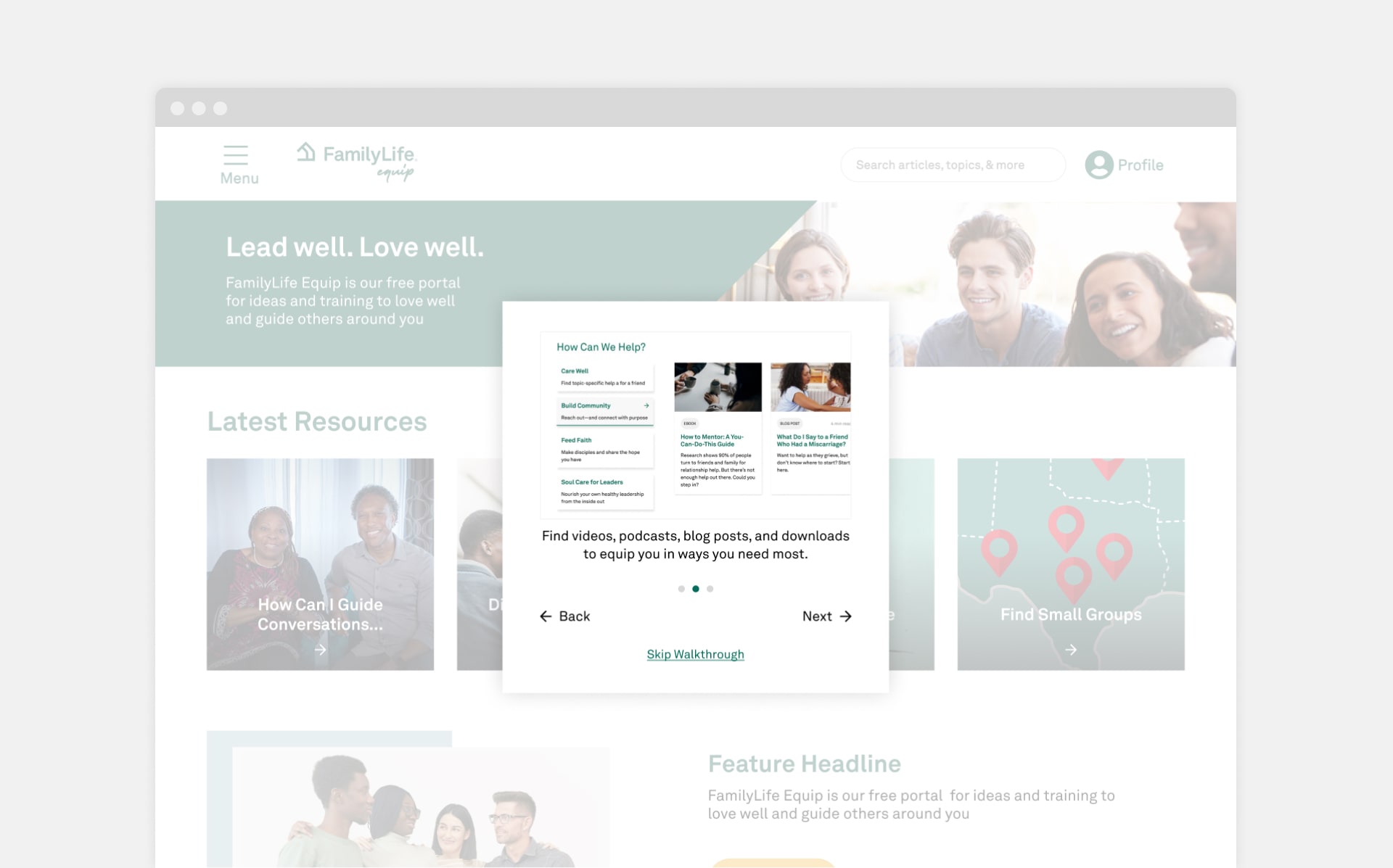
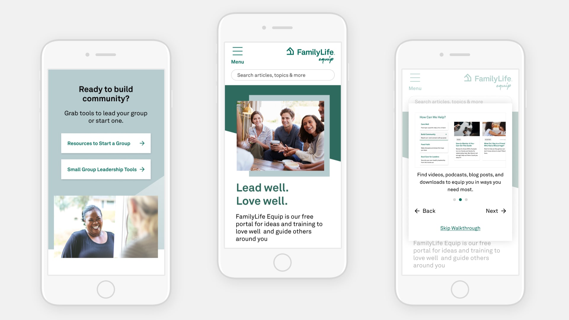
The final designs reflected feedback from both users and stakeholders. Users liked the idea of "test driving" the experience before signing up, so an option to preview the portal and check out a sample set of resources was added. To make navigation easier, the portal also features a walkthrough of the experience and a list of categories to help users explore the different topics and resources available.
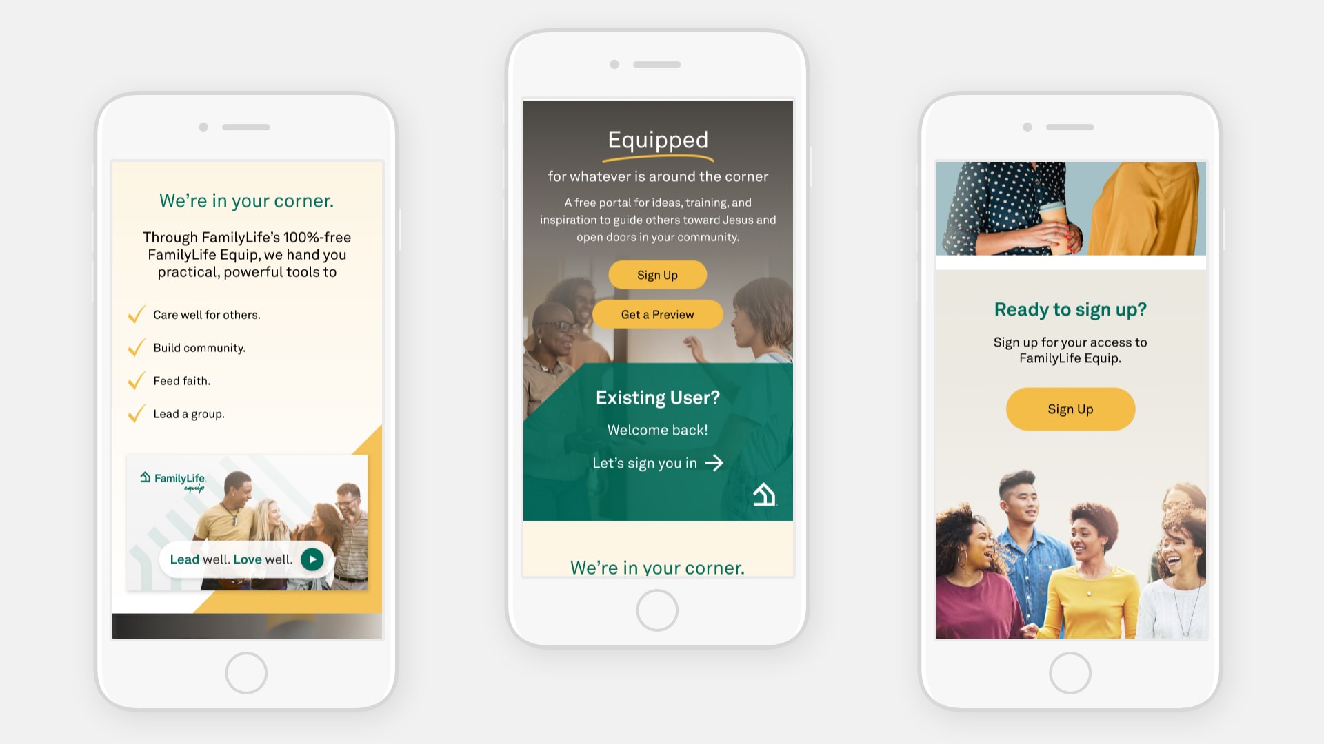
Landing Page
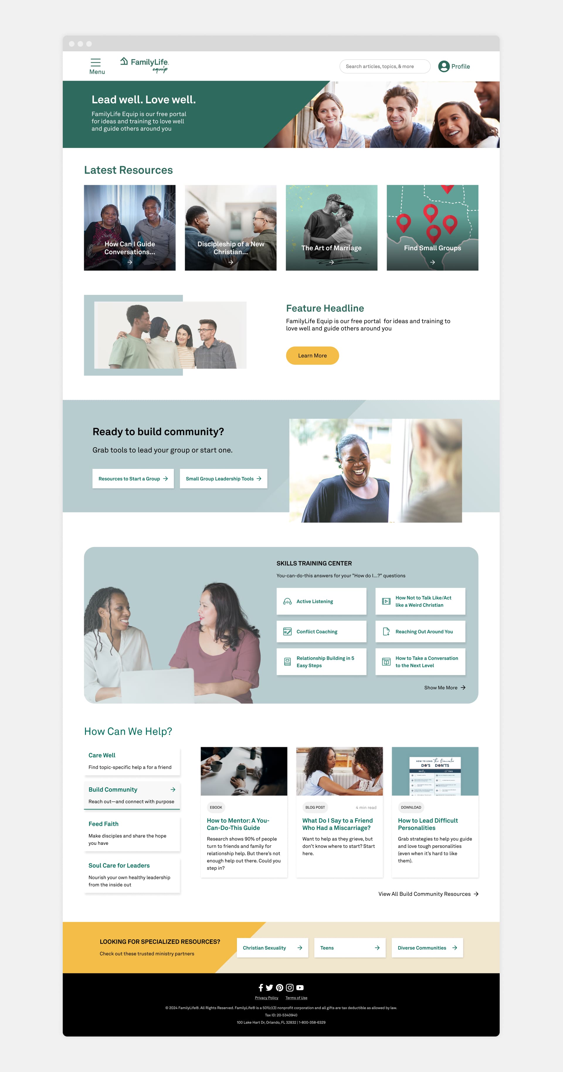
Online Portal & Walkthrough
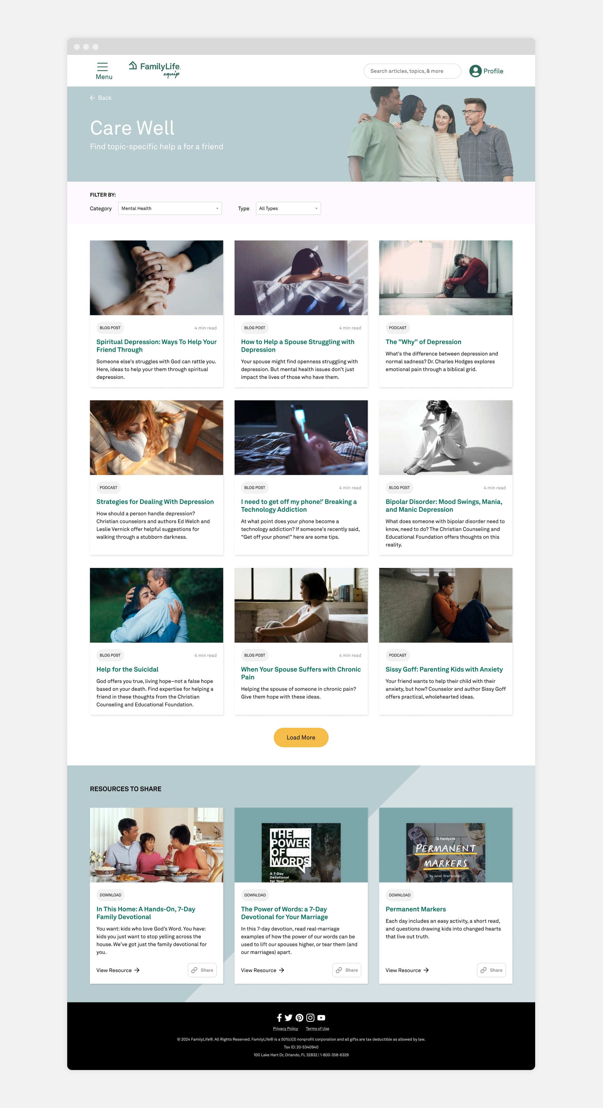
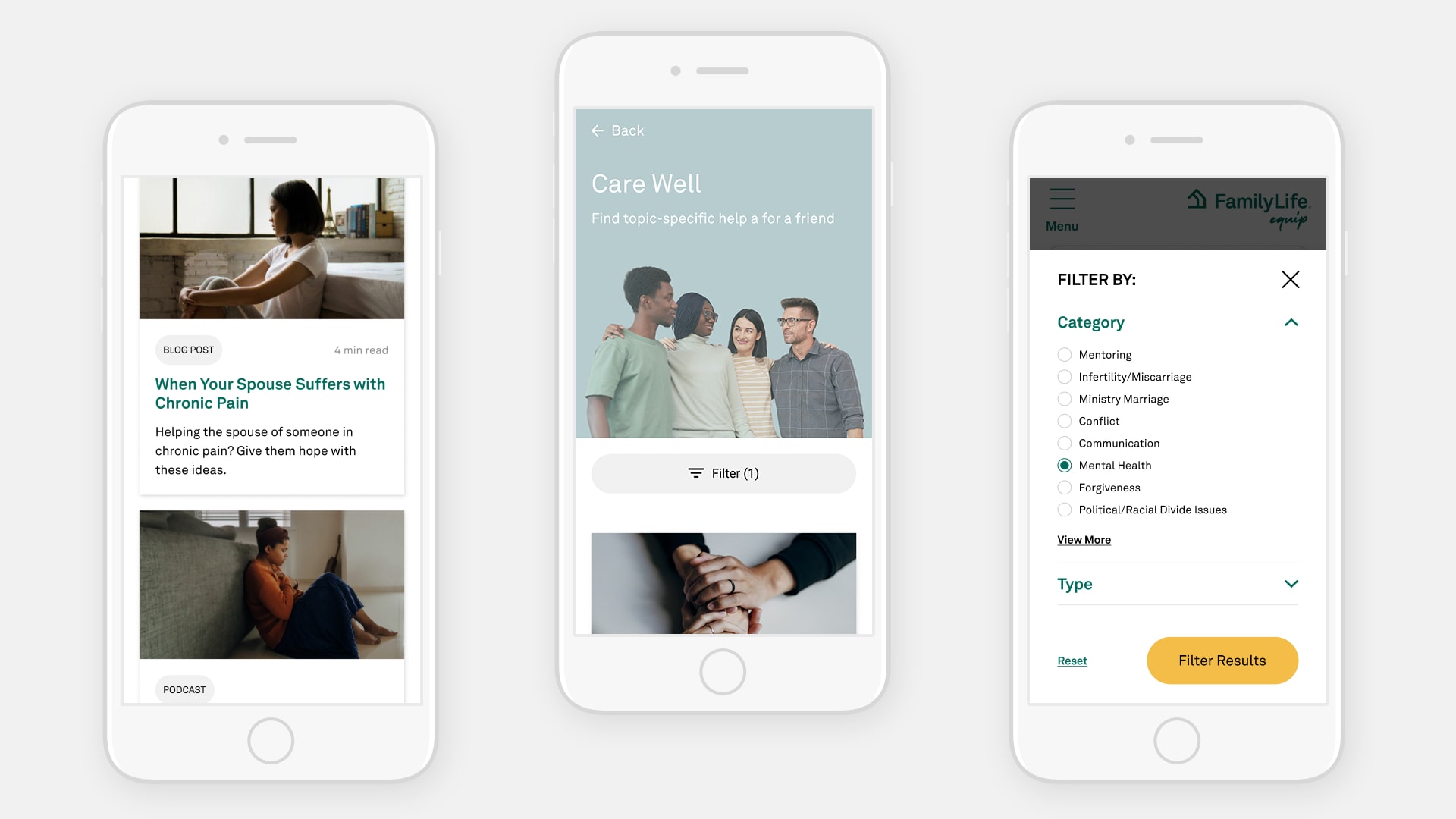
Category Page
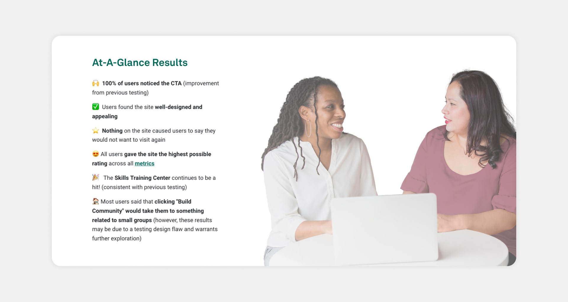
User Testing Results
Working with the UX Research team, the site was tested post-launch with a general audience, making sure the site's purpose was clear and the main CTAs were easy to spot. Users were asked for their thoughts on what caught their interest, any pain points, and their first impressions as they scrolled through the pages. Here are the key findings:

“I believe this site would help me lead small groups more effectively.”
User Feedback

“It has a lot of good resources that seem interesting and make me want to read it.”
User Feedback

“There's a lot of resources here that will help me reach other people in a more meaningful way.”
User Feedback
Learnings and takeaways
I enjoyed tackling the unique challenges this project brought and creating an experience from the ground up. Working with the team to refine and validate our ideas along the way was a great process too. It was also really rewarding to hear directly from users after launch that they enjoyed the experience we created.