Overview
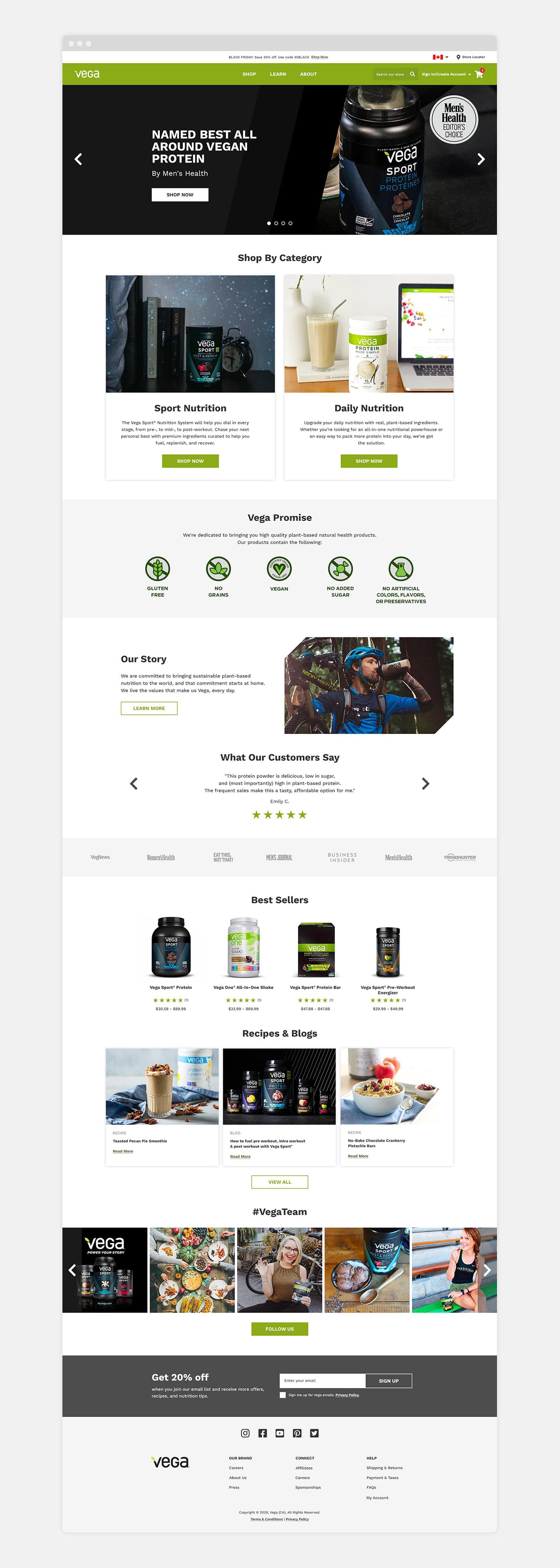
Vega is best known for their line of plant-based nutritional products. I was tasked to redesign a few of their main pages including the homepage, navigation and product pages. The goal was to make the website a simple, engaging, user-friendly experience that reflects the company’s values and diverse product line.
As the sole UI/UX designer, I collaborated with a digital team throughout the project including developers, eCommerce specialists and the eCommerce Director.
The Challenge
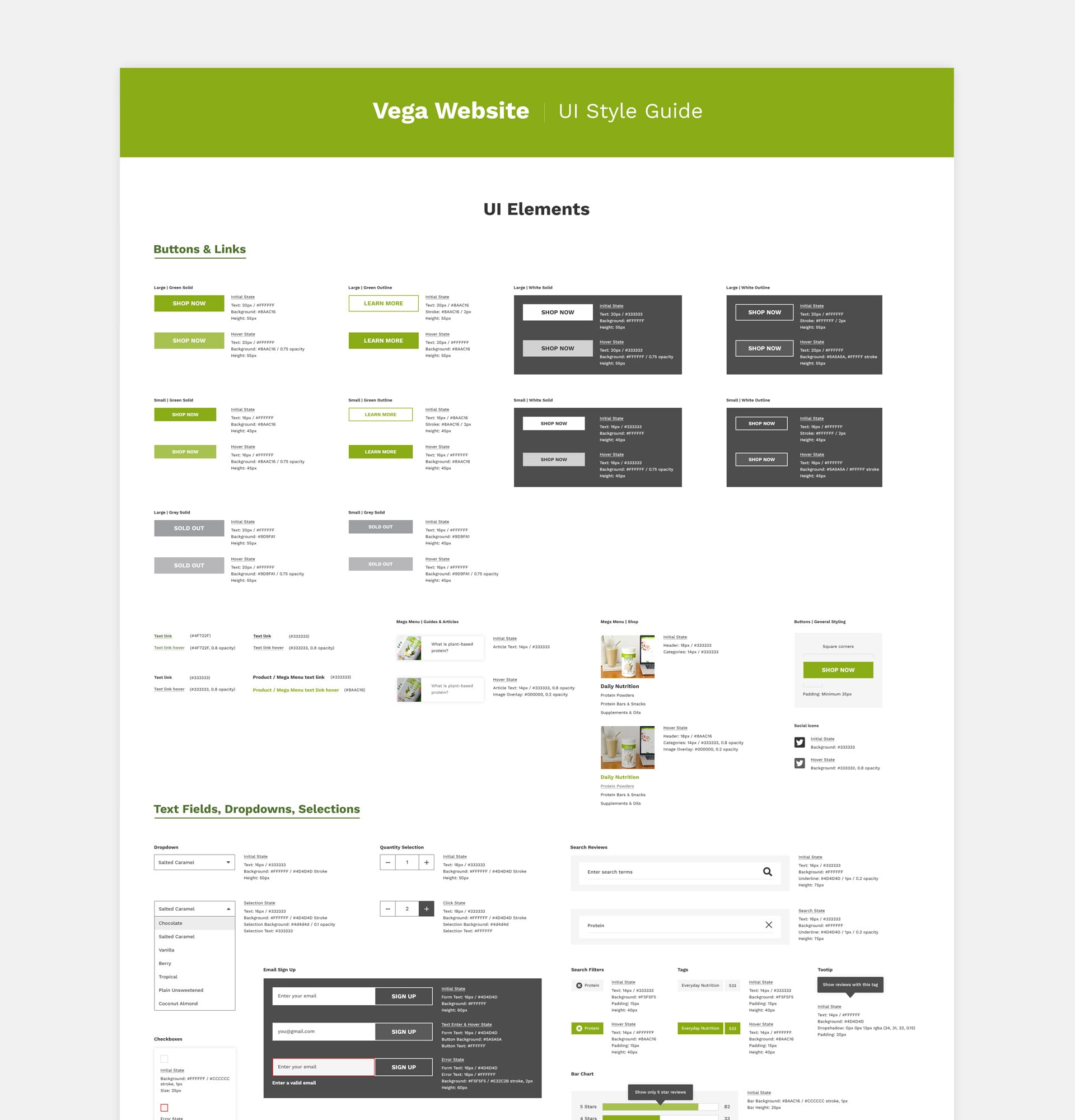
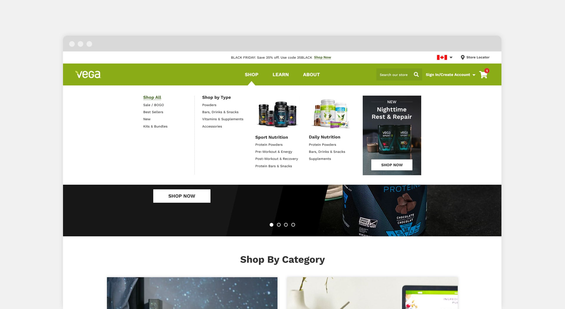
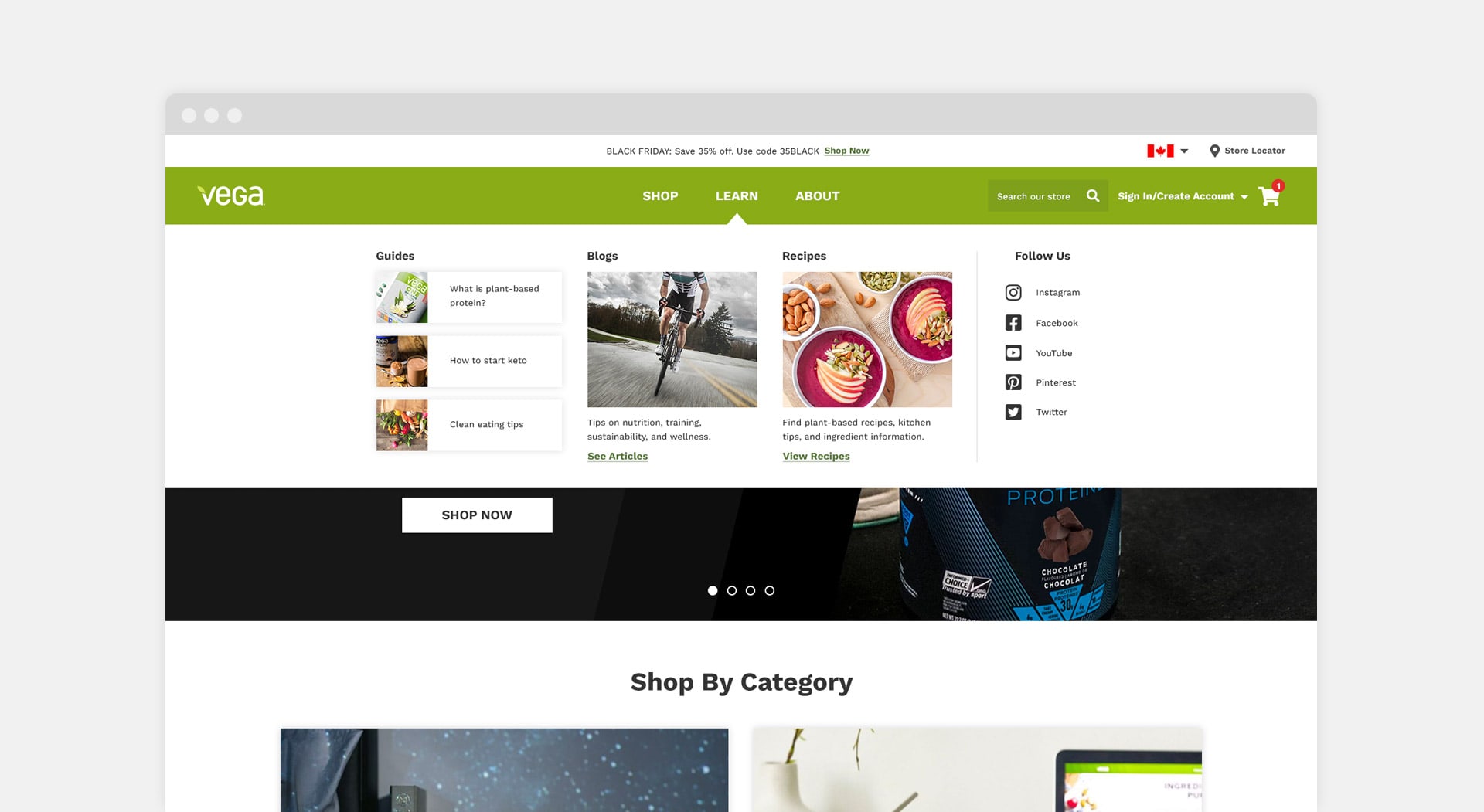
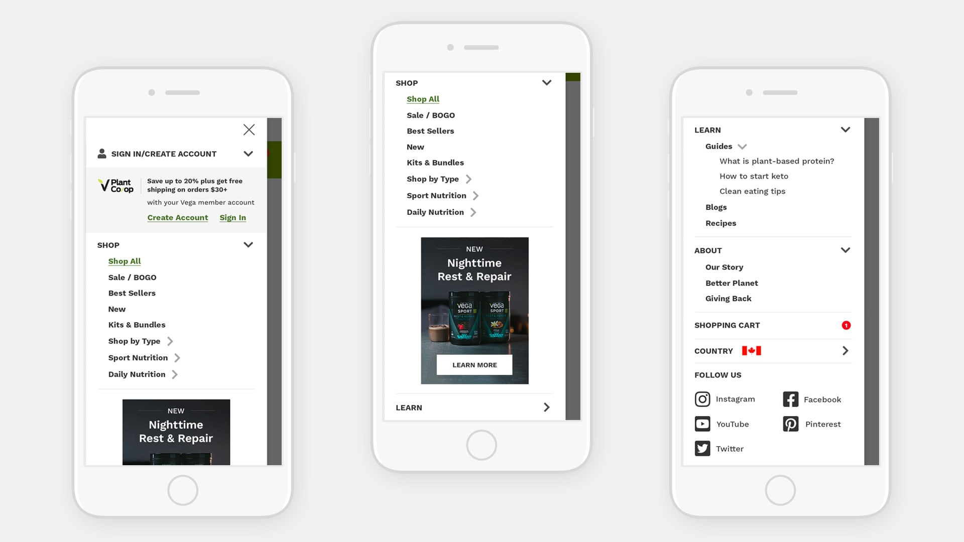
Main challenges include: (1) Improving the hierarchy and order of elements to ensure a more intuitive user experience; (2) Allowing for easy access to Sport and Daily Nutrition categories; (3) Simplifying the navigation and designing the mega menu to be more visually engaging; (4) Creating a style guide to capture UI elements and typography usage throughout the website
Details
Research and Insights
To get a full understanding on how to best tackle the challenges, I conducted competitive research by analyzing eCommerce examples from various brands. They include related brands (e.g. Soylent, Orgain, Ancient Nutrition) as well as general eCommerce brands (e.g. Goodwell, Umbra).
A few key takeaways:
- Best-in-class examples have a good balance of white space which minimizes visual clutter and helps the user focus on specific elements
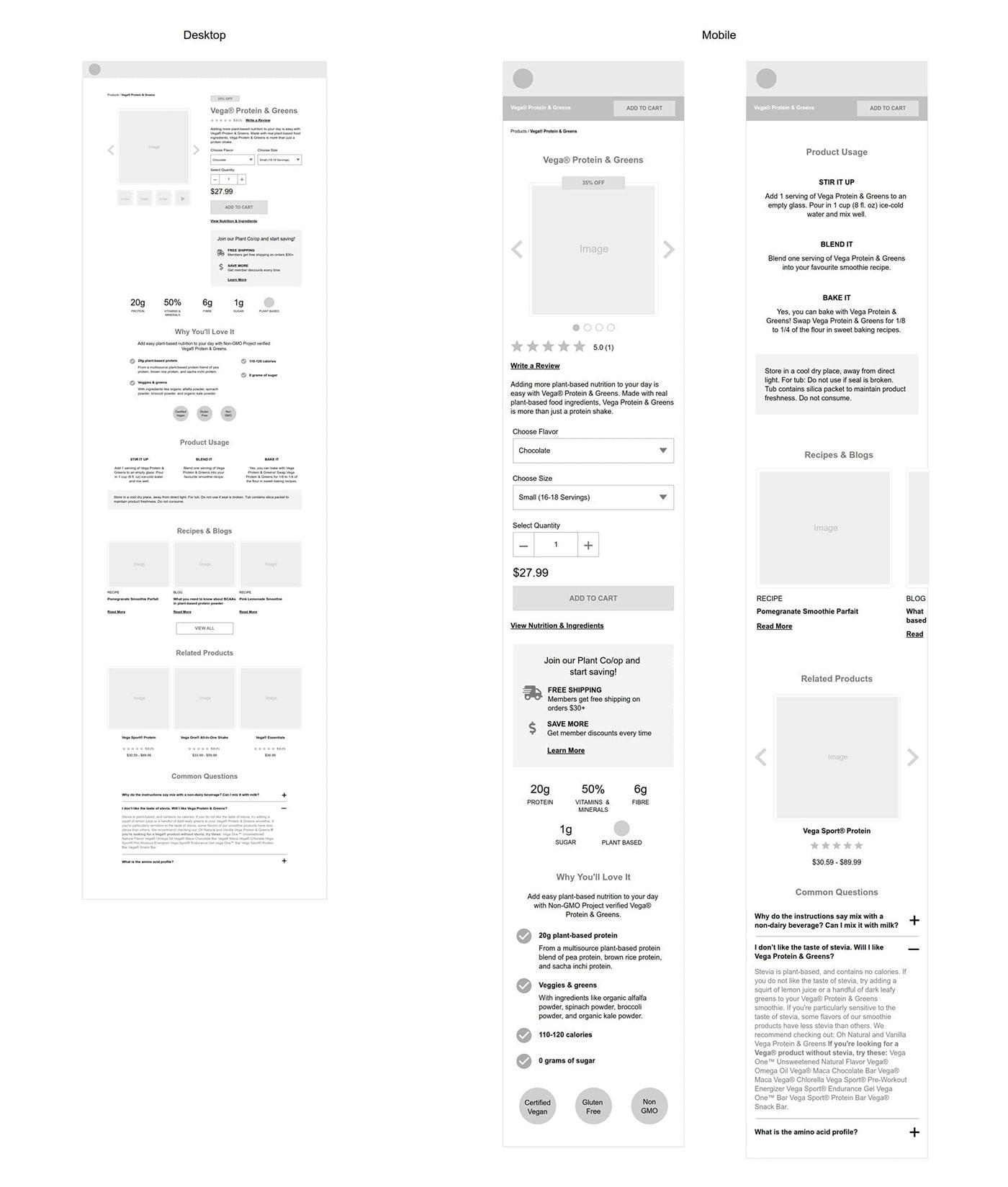
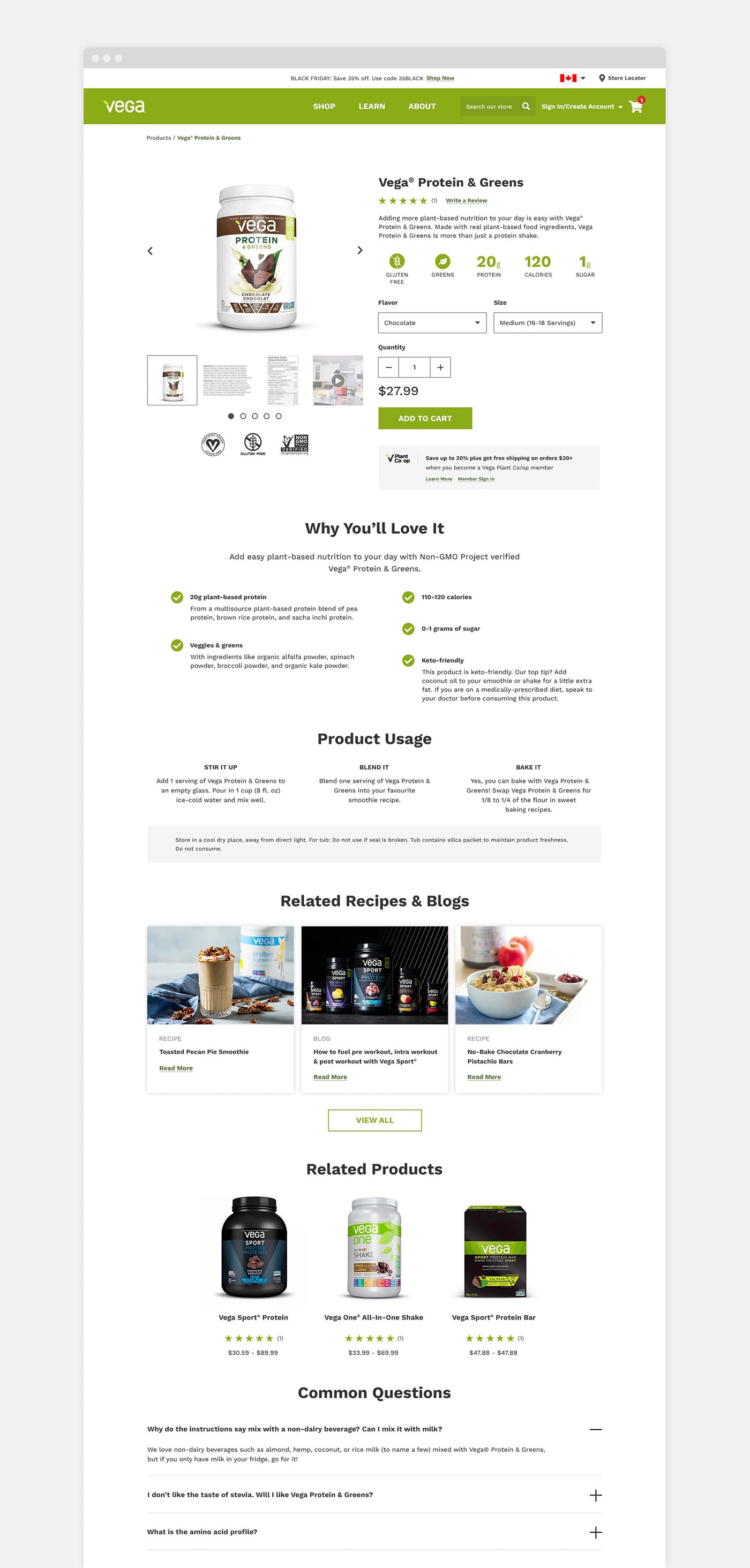
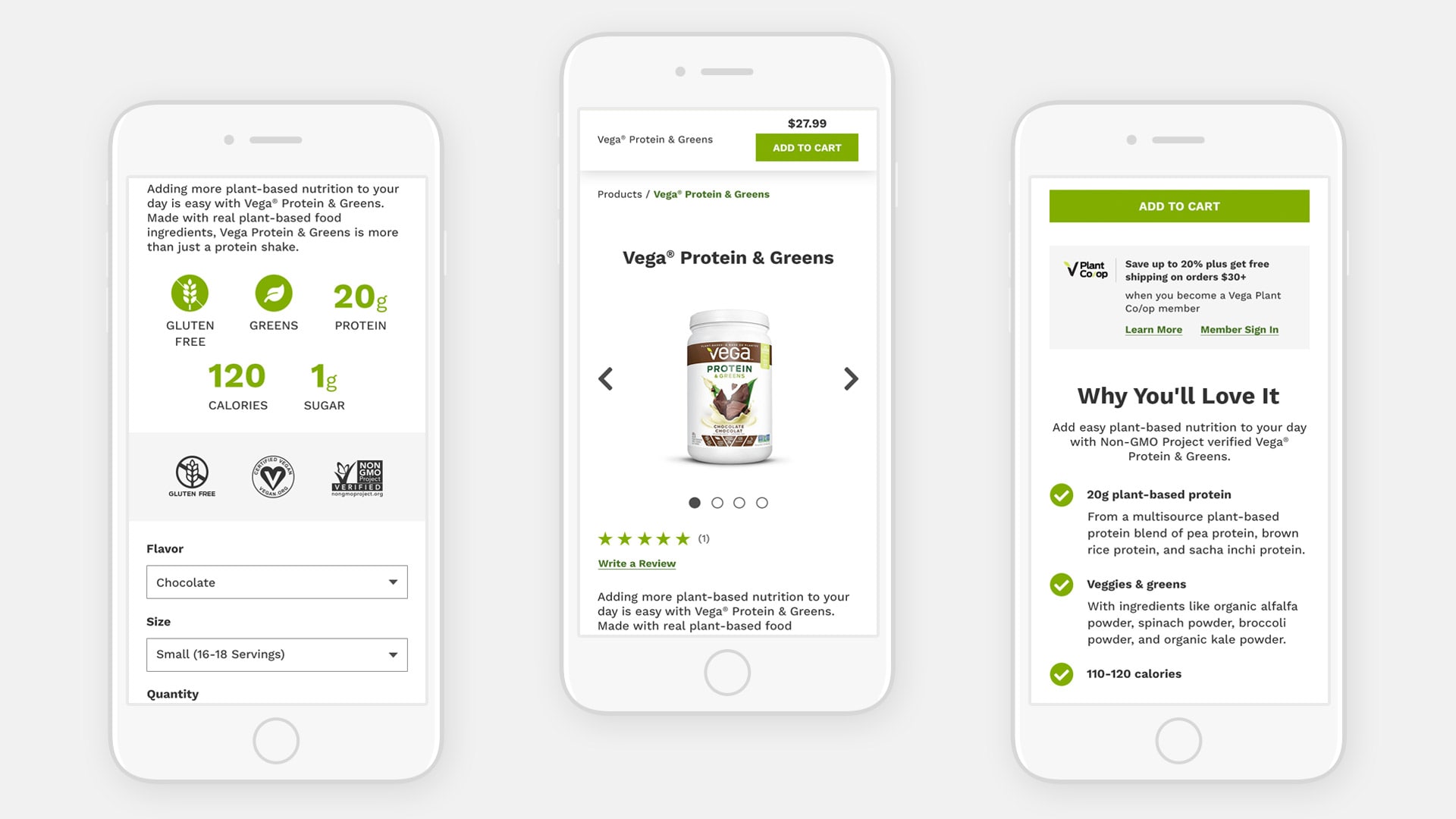
- On product pages, having usage and benefits clearly laid out is a great selling point and allows the user to make an informed purchase decision
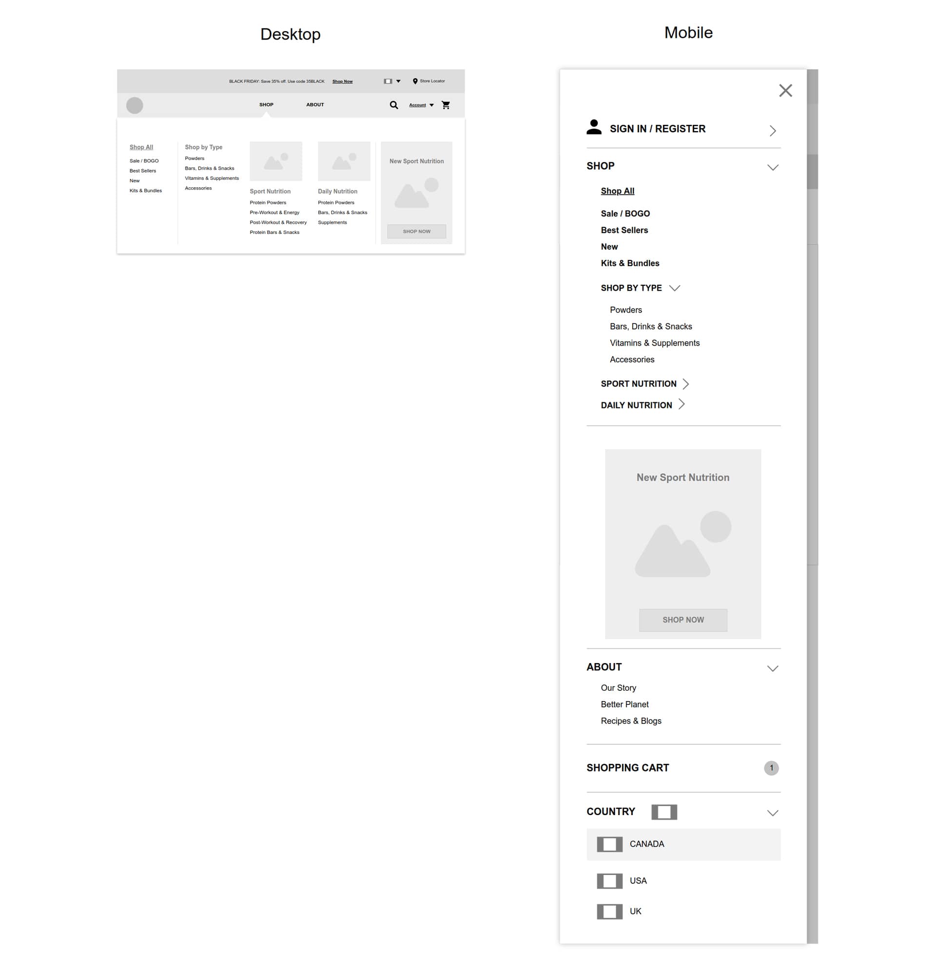
- Showcasing product photography in the mega menu highlights the products and creates visual interest
- Incorporating social proof (e.g. testimonials, Instagram carousels) adds credibility and helps to influence product purchases
Wireframing
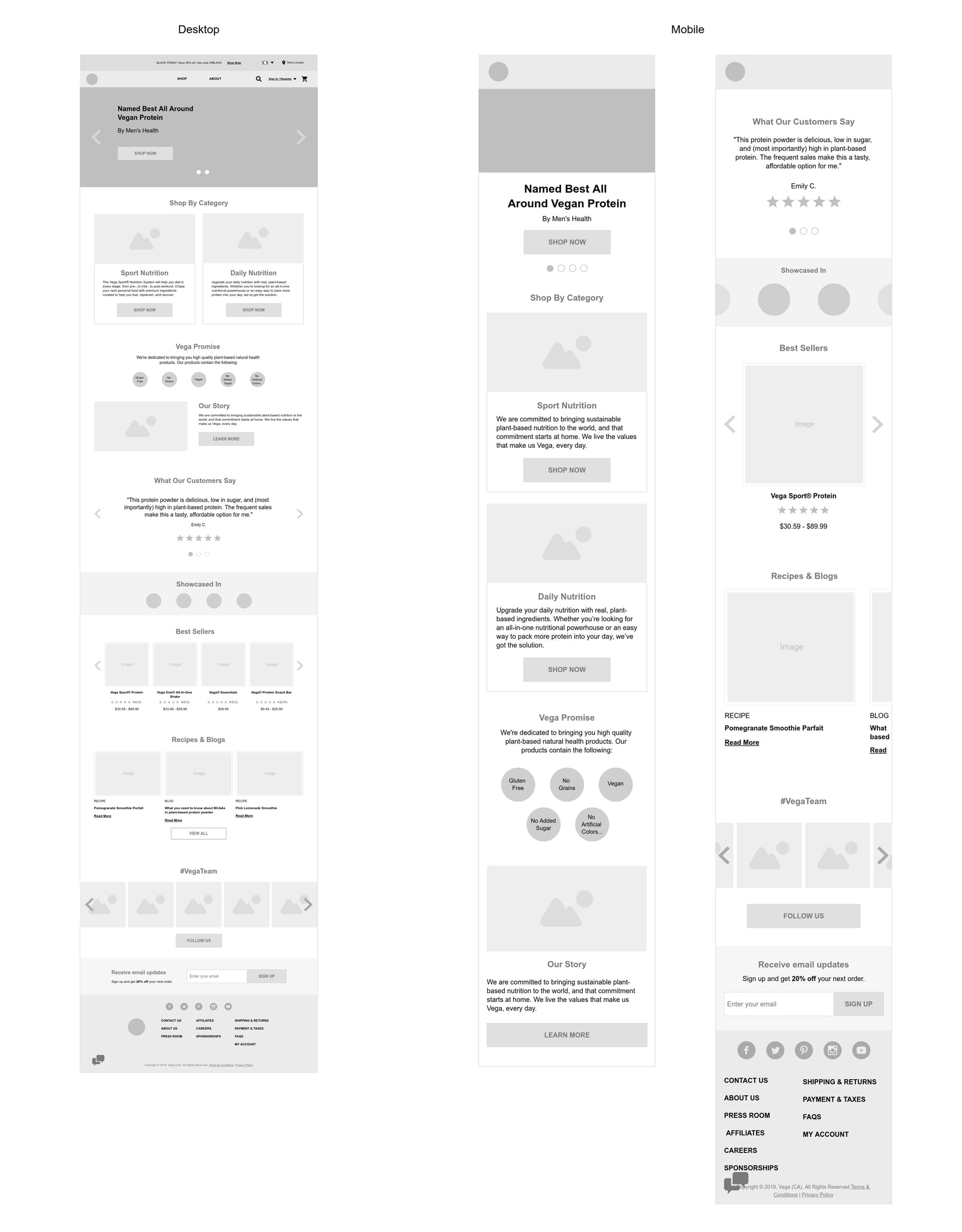
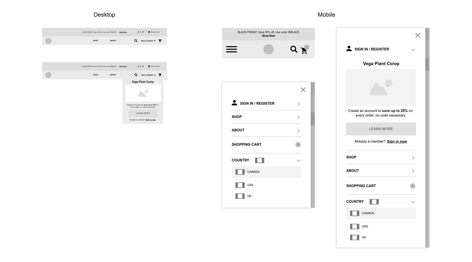
Next I worked on the information architecture and low-fi concepts for the main pages including the homepage, navigation, mega menu and product detail page. Weekly meetings were held to go over wireframes with the team and discuss development constraints.
Homepage
Navigation
Mega Menu
Product Detail Page
The Solution
To go along with the mockups, I created a UI style guide to capture all common UI elements, colours, and typography. This was effective in ensuring consistency, clarity and quality throughout the design process.
Style Guide
Homepage
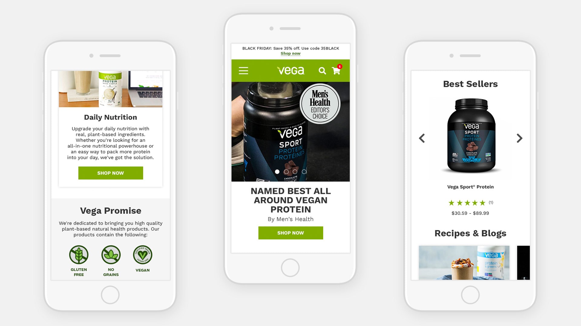
Navigation & Mega Menu
Product Detail Page
Learnings and takeaways
This project was a great opportunity to apply my eCommerce knowledge and experience in improving the digital experience of a well-known brand. In addition to the designs, a lot of work went into strategy as well as gathering insights from various teams and departments to ensure the best user experience. I have enjoyed collaborating with the team and am proud of the overall effort in bringing this project to life.
